记录一则关于弹性布局的CSS bug
更新:Firefox上的这个bug反馈已经被关闭,原因是判定和另一个bug重复,而那个bug已经是10年前就有人提出了,现在依然没有修好,估计未来也不打算修了
当同时使用flex-wrap: wrap、width: max-content和column-gap这三个属性时,会导致容器宽度计算错误。 可以直接点击该链接进行查看:https://codepen.io/vcxldk/pen/NWmLZQO 。 或者让浏览器渲染以下HTML代码:
html
<html>
  <body>
     <div class="container">
  <div class="flex-wrap">
    <div class="box">1 50*50</div>
    <div class="box">2 50*50</div>
    <div class="box">3 50*50</div>
    <div class="box">4 50*50</div>
    <div class="box">5 50*50</div>
    <div class="box">6 50*50</div>
  </div>
</div>
<style>
.container {
  width: 100px;
  height: 100px;
  position: relative;
}

.flex-wrap {
  position: absolute;

  width: max-content;
  height: 100%;

  box-sizing: content-box;
  background-color: gray;

  display: flex;
  flex-wrap: wrap;
  flex-direction: column;
  column-gap: 10px;
}

.box {
  box-sizing: border-box;
  width: 50px;
  height: 50px;
  border: solid 1px black;
  color: white;
}
    </style>
  </body>
<html>在Chrome和Firefox中渲染结果也是不同,Chrome中flex-wrap的宽度未计算column-gap的值,Firefox中flex-wrap的宽度则是直接等于子元素宽度: 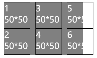
 目前已在Chromium和Bugzilla提交bug,等待后续处理